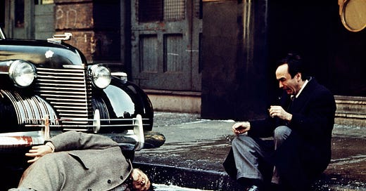
COLOR FOR STORYTELLING
How films use colours for storytelling and how digital artists can benefit from it
Did you know that classic mafia films used orange tones in their frames to foreshadow chaos and violence? It's a clever technique that adds to the tension and anticipation of the audience. Pretty cool, right?
Choosing the colors in your shot is not just about adding some pretty hues to your pages, it's about using color to evoke emotions, set the mood, and enhance the atmosphere of your story. For instance, while red can represent violence and anger, it can also suggest love and passion. Blue, on the other hand, can convey feelings of calmness and sadness, while green can signify hope or even the mundane aspects of life. Each color can have multiple meanings, and it's up to us as artists to use them in a way that best serves our narrative.
It's truly incredible how colors can elevate the meaning of a story. As digital artists, we have a lot to gain from studying cinema, particularly when it comes to the use of color. By understanding how specific hues can elicit certain emotions, we can incorporate them more effectively into our artwork and create a deeper impact on our audience.
Here’s an excellent video that explains the effective use of color in films which I hope you’ll all benefit from:


